Why UX Principles Matter in Slide Design
Ever wonder why some slides just click while others fall flat? The secret is UX. Following UX principles makes slides clearer, easier to read, and keeps your audience focused. A smart layout and clear hierarchy help people grasp ideas faster and remember the main points.
Check out the before-and-after examples on Smallppt—UX tweaks make slides more digestible, appealing, and easier to follow.
Mastering PowerPoint best practices with UX in mind turns your presentations from just “good” to truly memorable.
15 UX Principles for Slide Design
When I create slides, I always keep UX principles in mind—they make my content clearer, easier to read, and keep the audience focused and engaged. Here are 15 key design principles I follow to make presentations both professional and effective:
1. Information Hierarchy
Organize content by importance to guide your audience's focus and create a clear visual hierarchy.
2. White Space
Avoid clutter and give each element room to breathe; it makes slides much easier to read.
3. Contrast
Make sure text and visuals stand out so your audience can grasp key points at a glance.
4. Fonts and Readability
Pick clear fonts, sizes, and spacing so your slides are easy on the eyes.
5. Consistency
Keep styles, colors, and layouts uniform for a polished, cohesive look.
6. Use of Color
Highlight key points with color to help your audience quickly understand the main takeaways.
7. Visual Cues
Use icons, arrows, or shapes to naturally guide attention.
8. Alignment and Layout
Balance and organize elements so slides look professional and structured.
9. Simplify
Cut out unnecessary content and keep the focus on your core message.
10. Data Visualization
Present data clearly with charts or graphs so it's easier to understand.
11. Interactive Elements
Use animations sparingly to support understanding, not distract.
12. Accessibility
Make sure your slides are readable and understandable for everyone.
13. Slide Flow and Sequence
Arrange ideas logically so the audience can follow along easily.
14. Feedback and Testing
Preview your slides and get feedback to make sure your message comes across clearly.
15. Interactivity and Storytelling
Let your slides support your story, keep your audience engaged, and make your presentation memorable.
By keeping these UX principles in mind, you can make your slides not just readable and visually appealing, but truly impactful. Try applying them in your next presentation—you'll notice the difference immediately.
Before-and-After Examples Using Smallppt Templates
With Smallppt's templates, you can see the difference good UX makes—it turns slide design improvements from something abstract into something real.
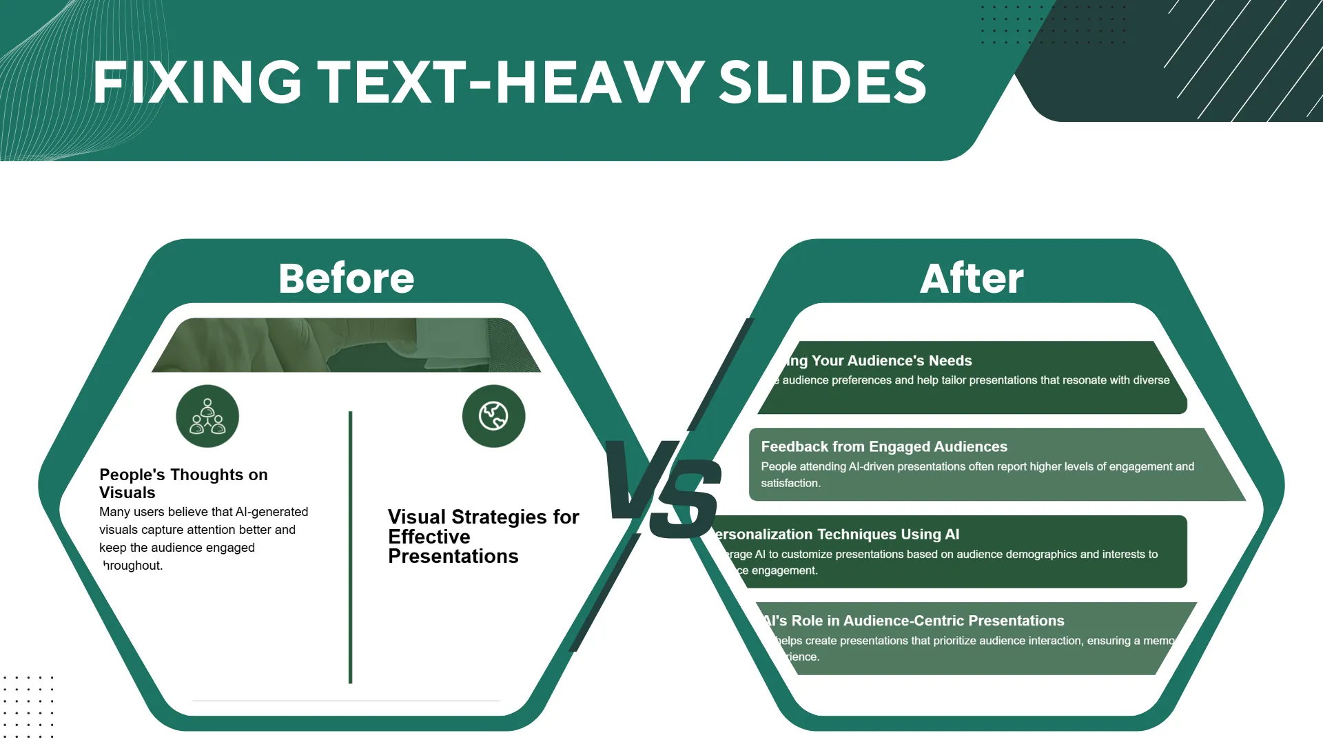
1. Fixing text-heavy slides
- Before: Packed with dense text and messy layouts, the audience struggles to find the important stuff.
- After: With a clear information hierarchy, plenty of white space, and readable fonts, slides become easy to scan, and your audience gets the core message right away.
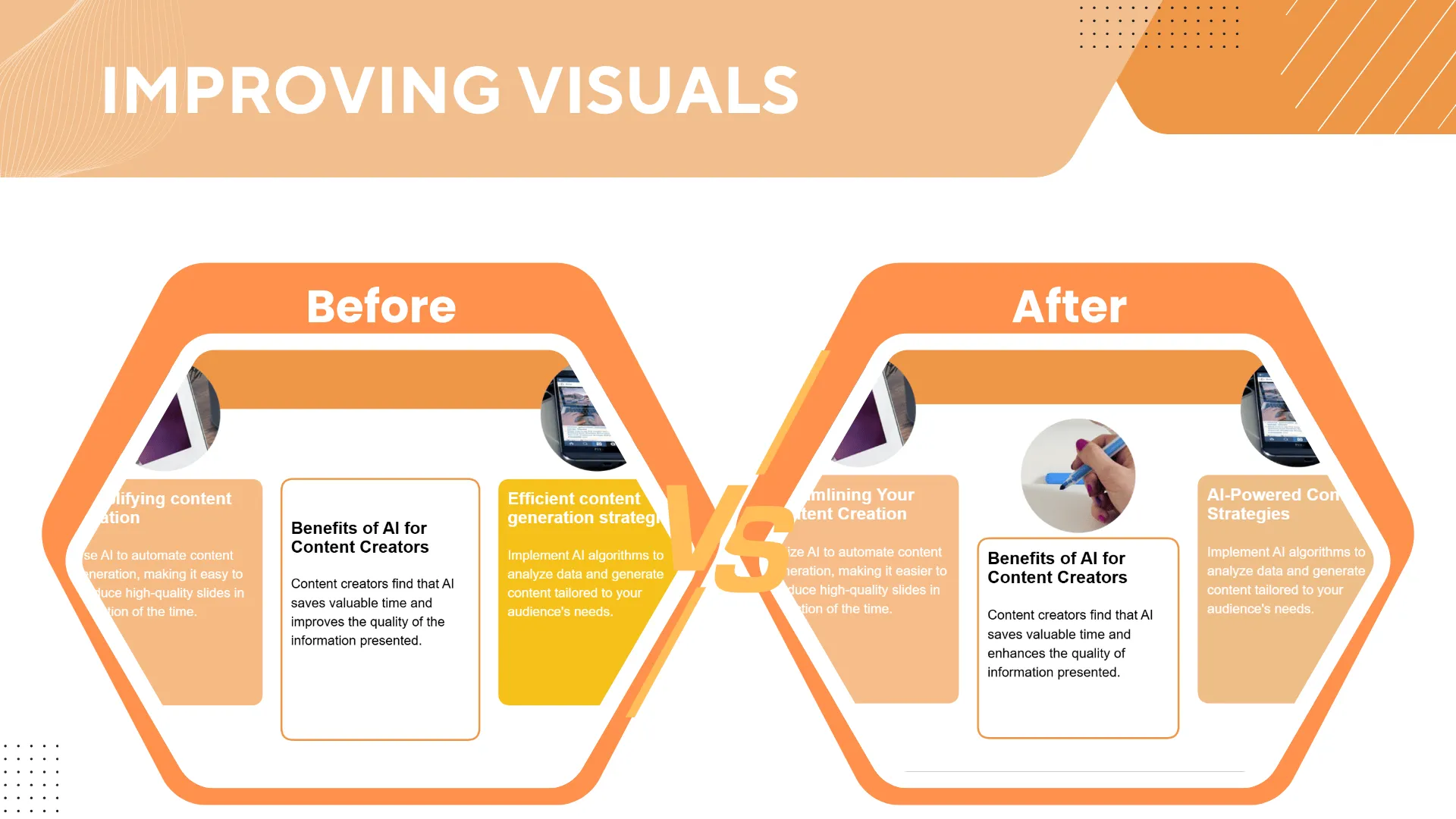
2. Improving visuals
- Before: Low contrast, misaligned graphics, and an overall cluttered look.
- After: Better use of color, contrast, and layout makes slides not just cleaner but also more visually engaging.
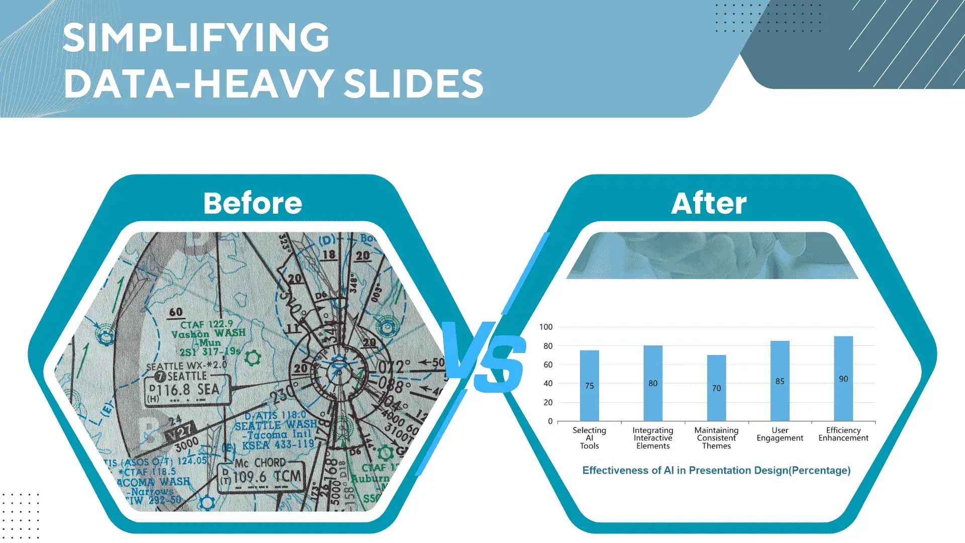
3. Simplifying data-heavy slides
- Before: Overloaded charts that overwhelm the audience with too much data.
- After: Simplified charts and highlighted takeaways deliver clear data visualization—your audience gets the point at a glance.
By using these before-and-after examples from Smallppt, you'll quickly pick up slide design best practices and raise your presentation game. Try it out, and you'll see how much more polished and engaging your slides can look.
Practical Tips for Applying UX Principles
Knowing the principles is one thing—but putting them into practice on your slides is where the real magic happens. Here are a few of my favorite UX PowerPoint tips to take your slides from just “okay” to genuinely impressive:
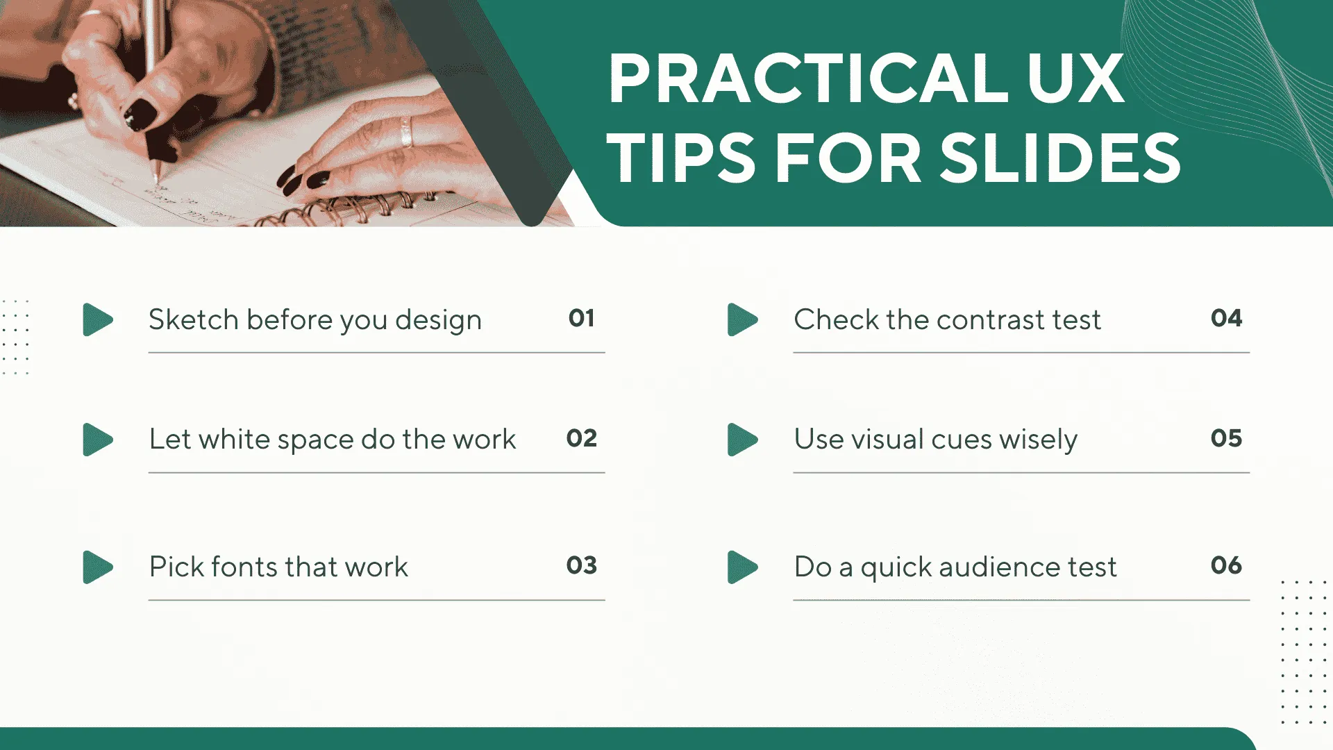
- Sketch before you design:I like to start with pen and paper (or a simple template) to map out the hierarchy—where the headings, points, and visuals should go.
- Let white space do the work: Stick to one or two key ideas per slide and give them breathing room. It instantly makes things look cleaner.
- Pick fonts that work:Skip the fancy stuff. Clean sans-serif fonts like Arial or Microsoft YaHei, big headings, and generous spacing always win.
- Check the contrast test:Shrink your slide down to thumbnail size. If you can still read the text, you're good to go.
- Use visual cues wisely:Arrows and icons can point attention where you want it—just don't go overboard.
- Do a quick audience test: Before presenting, I'll have a colleague glance at my slides. If they catch the main idea in 5 seconds, I know it's working.
With these tips—and a little help from presentation design templates—you can build slides that look sharp, communicate clearly, and actually keep people engaged.Give them a try in your next deck, and you'll see the difference.
Key Takeaways from UX Slide Design
We've learned 15 UX principles that make slides clearer, easier to read, and way more engaging. From hierarchy and white space to clean fonts and smart data visuals, these simple tweaks instantly give your slides a professional edge.
But knowing isn't enough—you've got to apply them. Smallppt templates make it easy to turn these ideas into polished, practical designs.
Use these best practices in your next deck and you'll see the difference: clearer communication, higher engagement, and a presentation that actually impresses.
Common Questions About UX Slide Design
Q1: What are the most important UX principles in slide design?
Focus on information hierarchy, readability, white space, and contrast; these principles are key to effective UX slide design.
Q2: How can I quickly improve my PowerPoint slides?
Simplify the content, use Smallppt templates, and follow UX design best practices to improve slide design efficiently.
Q3: What mistakes should I avoid in UX slide design?
Avoid cluttered slides, hard-to-read fonts, low contrast, and inconsistent styles to maintain a professional presentation.
Q4: How does UX affect audience engagement?
Good UX improves comprehension, retention, and overall presentation impact.
Q5: What tools help apply UX principles in presentations?
Smallppt templates, PowerPoint built-in features, and design software can all help implement effective PowerPoint design.