Color isn't just decoration—it shapes how your audience sees, feels, and decides. Blue builds trust and professionalism, red sparks urgency and action. Using color smartly makes your message stick and creates positive vibes around your brand or idea.
For pitch decks, the right colors are key. They show your brand, build trust, and grab investors' attention. A good palette makes your slides more persuasive and helps your audience connect with your ideas—turning your pitch into real opportunities.
Understanding Color Psychology in Pitch Decks
Color is more than just decoration in your pitch deck — it plays a significant role in influencing your audience's emotions and perceptions.
- Red:Evokes passion and urgency, capturing attention and inspiring action, often associated with excitement or importance.
- Blue:Conveys trust and professionalism, making you appear more credible.
- Yellow: Boosts energy and sparks creativity, signaling an innovative or exciting opportunity.
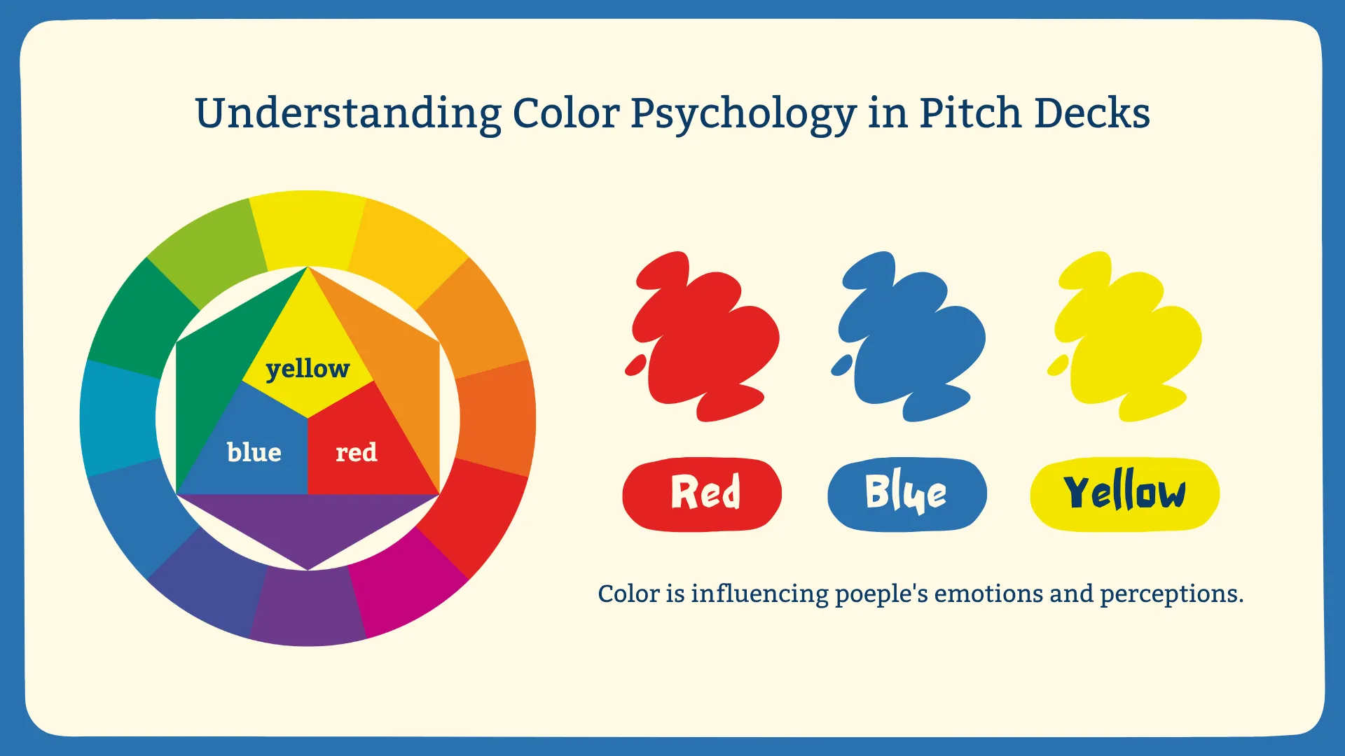
Choosing the right colors isn’t just about aesthetics; it’s about tapping into the psychology behind color to guide your audience's emotional response.
However, it’s important to remember that color meanings vary across cultures. For example, red symbolizes luck and celebration in many Asian cultures, but in Western cultures, it can signal danger or caution.
To avoid misinterpretation and ensure your pitch resonates with your audience, it's crucial to understand their cultural background before selecting your color palette. A little research can save you from awkward or unintentional mistakes.
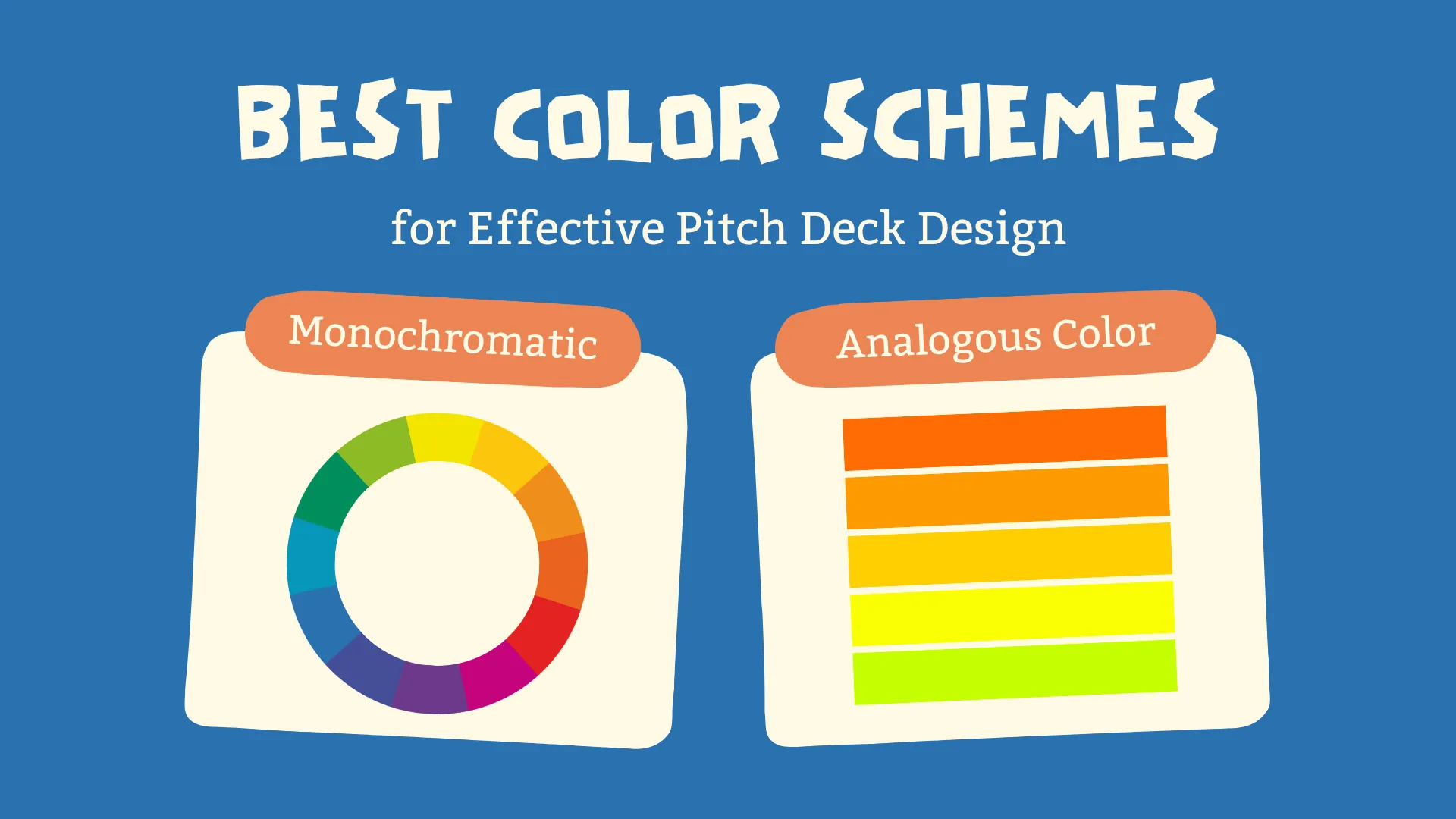
Best Color Schemes for Effective Pitch Deck Design
Below, we will recommend some core color schemes that you can apply to your presentations to make them more professional:
- Monochromatic Scheme
By utilizing various variations of a single color, we can create harmonious and professional visual effects. This scheme is suitable for presentations with a tech or minimalist style.
- Analogous Color Scheme
Combining colors adjacent on the color wheel together creates a harmonious and peaceful visual effect. This scheme is ideal for expressing themes such as health, nature, and warmth, giving the presentation pages a soft and tranquil feel.
- Complementary Color Scheme
Pairing colors opposite each other on the color wheel together can create contrast and produce a strong visual impact, quickly capturing the audience's attention. This scheme is generally used in advertising or entertainment visuals.
- Split Complementary Color Scheme
Using one main color as the center and pairing two colors from its complementary side, this scheme creates a balanced yet vibrant effect. It is suitable for use in web design, brand illustration, or infographics, making the entire page richer.
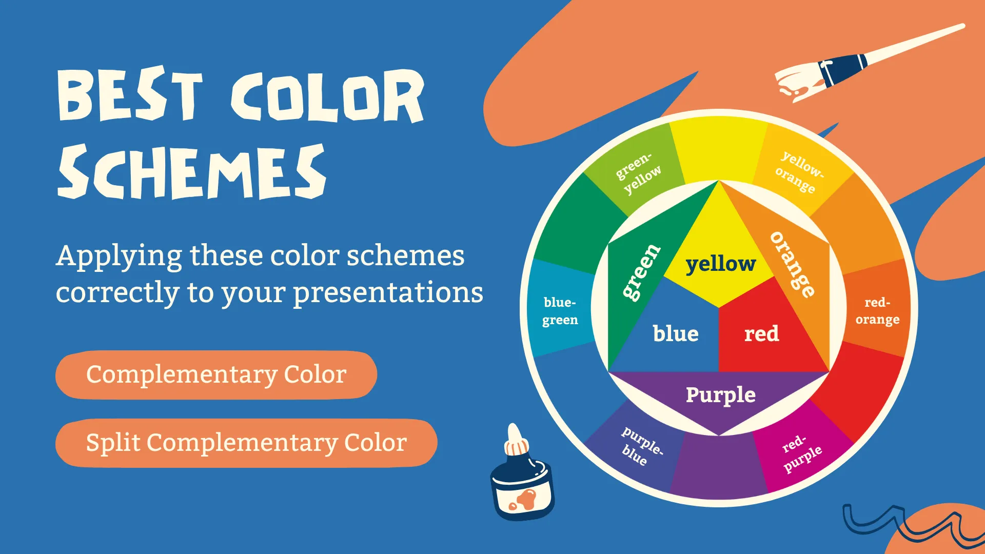
By applying these color schemes correctly to your presentations, I believe they can make your presentations more attractive. You can now give it a try and experience it!
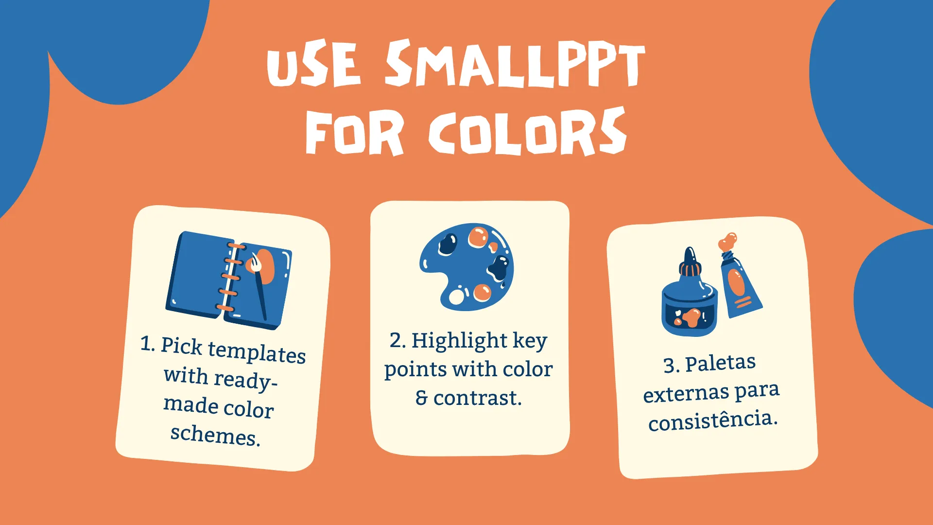
Practical Application: Using Smallppt Color Tools
Now I'm going to recommend an AI tool that offers several features to help you effectively and reasonably apply colors in your presentations.
1. Smart Template Selection
The template library of Smallppt contains a large number of professional templates, which have been designed with color schemes according to different themes. After generating the outline, you can choose a template that matches your style and theme. This not only maintains harmony between slides but also saves you a lot of design time.
2. How to Use Smallppt to Optimize Colors
Do you remember how different colors can evoke different psychological reactions? Now we can cleverly apply this principle and use Smallppt's layout suggestions to highlight the focus, emphasize the contrast between text and background, and effectively utilize the color scheme.
3. Combining with External Color Tools
Here, I recommend some highly customizable palettes, such as Adobe Color, Coolors, or Canva's palette generators. After obtaining a palette, you can apply it to your Smallppt slides to match your brand image, thus creating excellent presentations.
In short, you can directly use Smallppt's professional templates according to the theme or style, or combine other color tools with Smallppt. This not only saves you a lot of time but also allows you to easily create presentations with professional color schemes.
Best Practices for Effective Color Usage in Pitch Decks
So what other tips can we use when designing presentations? Here are three skills to enhance your presentation's professionalism:
1. Maintain Color Consistency
Color consistency is important, especially in presentations. Choosing a unified color scheme avoids distractions from excessive colors. This not only reinforces your brand identity but also makes your content appear organized and clean.
2. Use Contrast to Improve Readability
Sufficient contrast between text and background enhances readability. However, ensure the contrast is appropriate—too low may make text hard to read, while too high can strain the eyes and disrupt focus. The optimal combination is black text on a light gray background.
3. Strategically Highlight Key Points
Extensive blocks of text in presentations can overwhelm audiences. Using accent colors effectively addresses this issue. Common accent colors like red or orange possess a strong visual impact, quickly capturing attention. However, avoid overusing accent colors, as this can cause visual fatigue and distract viewers.
Skillfully applying these skills not only guides audience attention but also improves the presentation's structure, making the content clearer and more organized.
FAQs: How Color Psychology Affects Pitch Decks
Q1: Why is color so important in presentations?
We all react to colors in different ways — some feel calm when they see blue, while others feel energized by red. Using color correctly can make your slides more persuasive and memorable.
Q2: Do cultural differences affect color choices?
Colors may carry different meanings across cultures, so consider your audience's background.
Q3: How many colors should I use in a presentation?
Typically use 2-4 colors: one primary, one secondary, and one or two accent colors for emphasis.
Q4: How does Smallppt help me create visually engaging slides?
Smallppt offers professionally designed templates, each with its own color scheme. You can select a template that aligns with your style and brand identity to enhance your slides' overall appearance.
Q5: Can Smallppt help adjust slide layouts and maintain consistency?
Yes! Smallppt's AI-powered slide generation ensures your presentation maintains consistent layouts and styling.