When designing slides, cramming too many elements and information onto a single page can often make it look cluttered and chaotic, lacking breathing room.
Cleverly using negative space allows you to create visually appealing and logical designs, helping guide your audience to focus on your core message.
Join us as we explore what negative space is and how to effectively use it in presentation design.
What Is Negative Space?
Negative space, also known as white space or empty space, refers to the unmarked, blank areas in a design, artwork, or visual composition.
It's the space surrounding and between the solid elements like graphics, text, or patterns (which form the positive space).
This emptiness is both functional and expressive. It actively guides the visual focus through its interaction with the solid elements, serving as a design language that blends aesthetics with practicality.
The Importance of Negative Space
Guide the audience focusing to your core information
Negative space helps organize information hierarchy. It highlights the main subject, improves text legibility, and lets viewers' eyes quickly find your key points.
Create visual breathing room
By deliberately leaving blank areas, it reduces the oppressive feeling of overcrowded elements. This establishes balance between the subject and the empty space, fostering visual harmony.
Builds simple elegance
Negative space prevents visual overload, leading to more sophisticated work.
Consider the classic FedEx logo: the clever arrow shape formed by the negative space between the "E" and "x" subtly conveys the brand's idea of "speed and precision".

Tips of Effectively Using White Space in Presentation Slides Design
1. Preserve Margin Space
When designing slides, you don’t need to fill every corner and every blank space on the page.
You can keep a certain distance between the text and the edge of the page, but try to make sure that the margins of each slide are the same, so that the whole presentation can be consistent.
2. Define Key Elements
Each slide should spotlight one core message or visual. Give it plenty of breathing room, free from distracting clutter. This naturally draws attention to what matters most.
3. Break Down Content
Don’t squeeze a whole section onto one or two slides. You can split it into digestible parts across multiple pages.
Similarly, you can refine the core information of the text and only put key information or words on page, try to keep the page concise, and avoid piling up text.
4. White Space Within Text
White space isn’t just for layout. Don’t forget the text itself.
Adjust line spacing, letter spacing (kerning), and font size to make text effortless to read and visually balance.
5. Use Contrast Strategically
Play with differences like in color, brightness, or scale to create visual tension.
For example, you can place a simple picture that can form a strong contrast with black on a black background, and add one or two sentences to describe the picture next to it. The font color can use the main color of the picture.
6. Leverage Images and Charts
If you have a lot of data in your presentation, you can present them in the form of charts or graphs. Compared with simply piling up a bunch of data on the page, charts are concise and intuitive, making it easier for the audience to understand.
And remember: a picture is worth a thousand words. If there is a suitable picture that can describe your text, you can put that picture directly on the slide page, which can reduce the text you put in the presentation.
Designing Slides with White Space
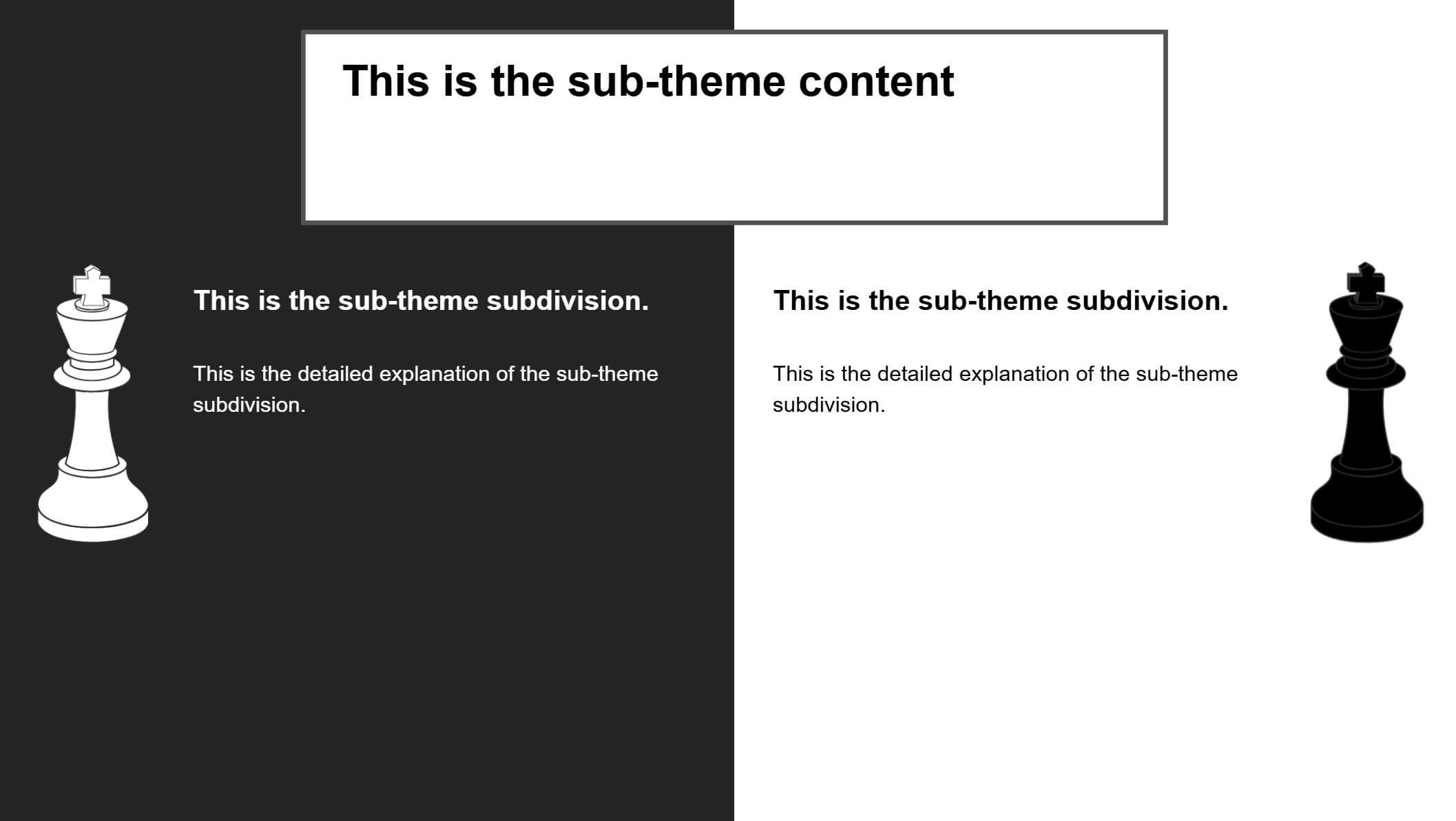
1.This slide uses black and white blocks to divide the layout, creating a visual sense of balance. The black and white pieces symbolize a game of strategy. If you're making a presentation comparing different elements, you could match the black and white pieces to the different items being compared. It's simple and direct.
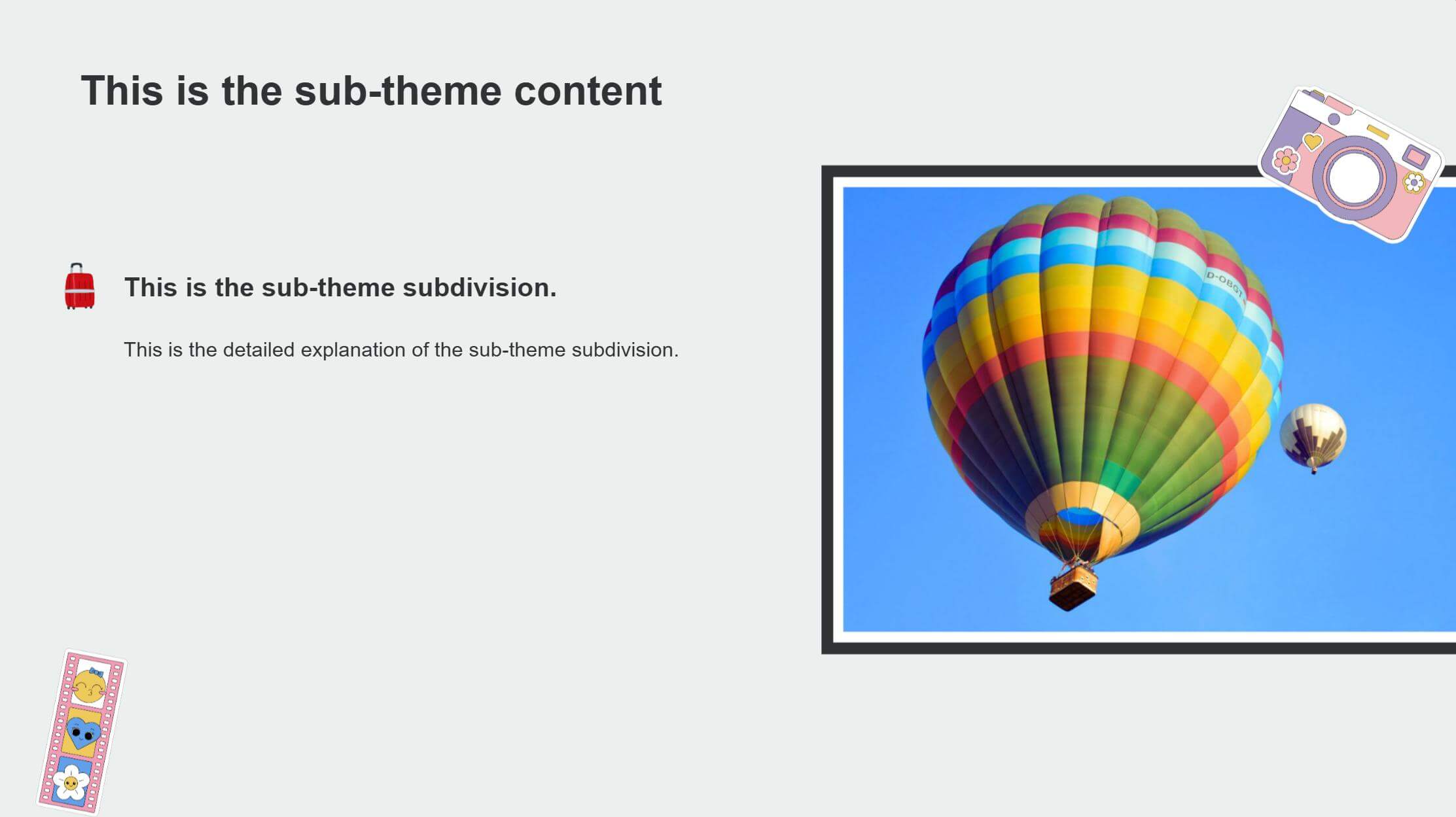
2.Plenty of white space surrounds both the images and text, making the hot air balloon picture the visual focus, which ties in nicely with the travel theme. The decorative elements add richness to the page, and because of the white space, they have breathing room too.
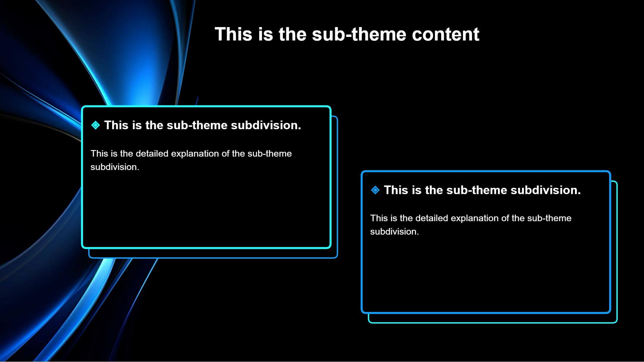
3.This slide creates large areas of "dark white space" using a black background. The two content blocks are placed on the left and right, enclosed by blue-bordered rectangles. These boxes contrast sharply with the black background. Inside, white space around the text ensures readability. The overall layout gives elements a sensible distribution and clear hierarchy, resulting in a clean, professional look.
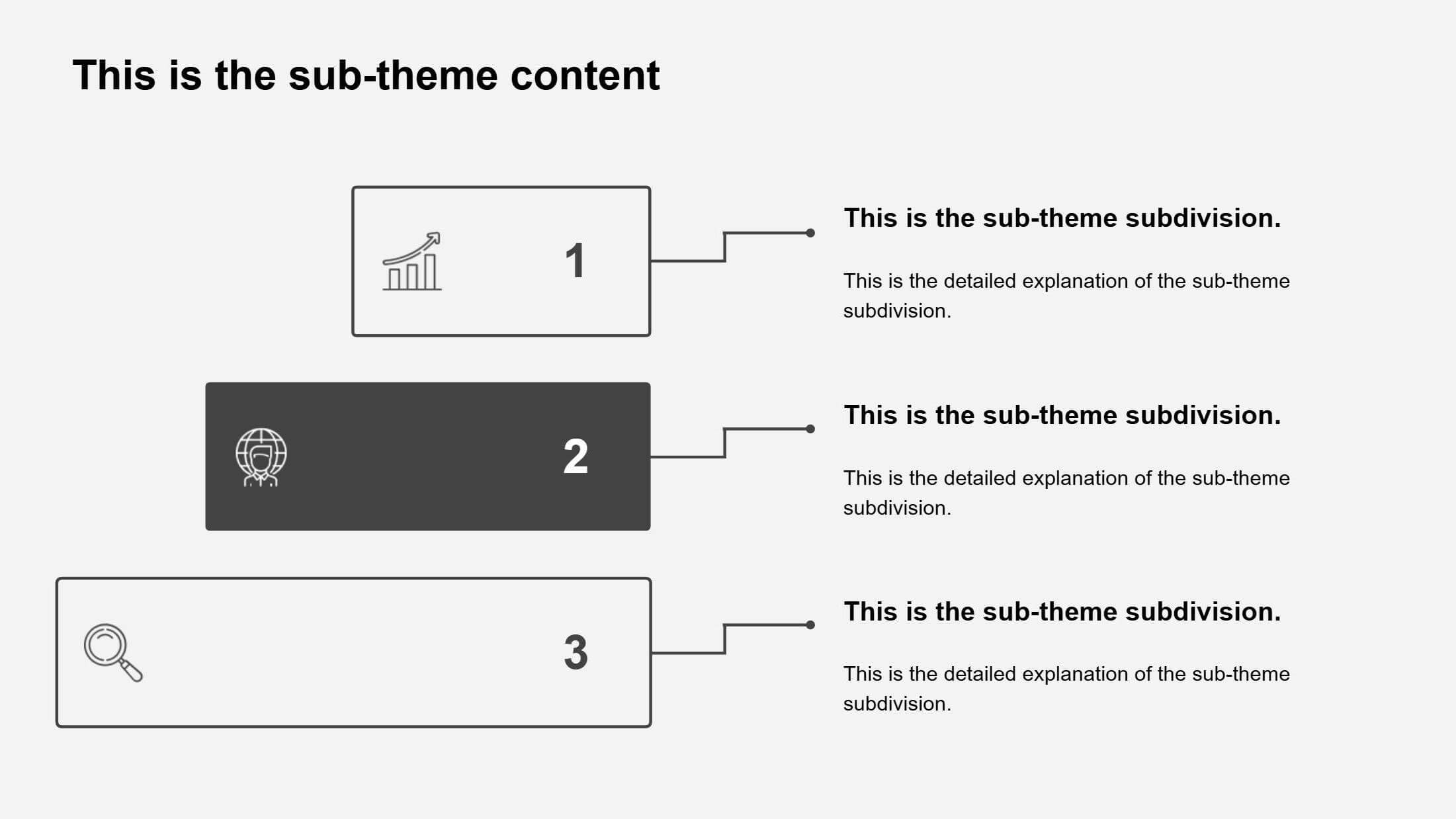
4.The white space around each content box and text creates distinct layers between elements. Within each box, small icons paired with numbers decorate the content, presented in a step-like format to show the hierarchical structure clearly. Ample space between all the elements reinforces the independence of each module.
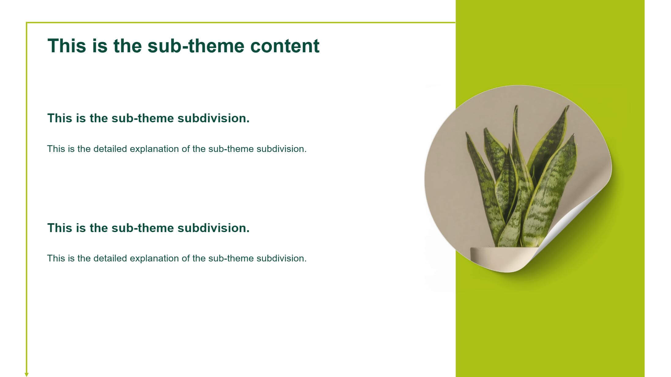
5.On this page, borders directly outline the text areas, ensuring text has a comfortable distance from the slide edges.
The outlined white areas also provide generous space for the text content. The line spacing between text is quite generous, preventing information from feeling crowded.
On the right, the green block contrasts with the text area on the left. Notice the circular image within it also has some space around it – it doesn't fill the entire area. This helps maintain overall balance and harmony.
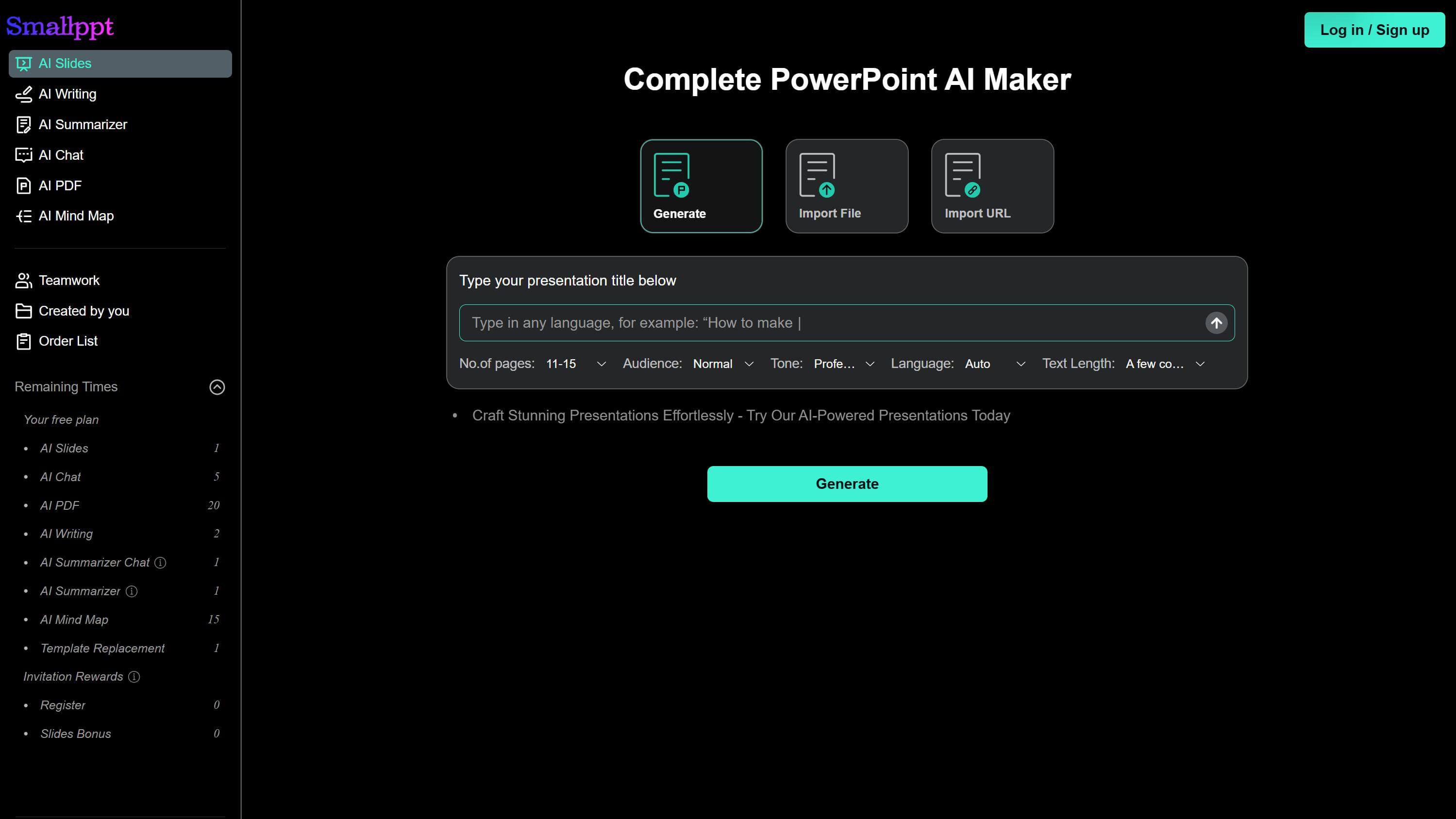
Looking for Great Templates of Negative Space Use?
At Smallppt, there’s a wide variety of presentation templates.
Designed by a professional team with thoughtful layouts, they masterfully blend the art of white space. This results in visual designs that are both professional and highly attractive.
Feel free to explore them anytime! Simply enter your keywords, or upload relevant documents/URLs.
Once your text outline is generated, click "Generate my presentation".You’ll then enter the template selection page.
White space isn’t ‘wasted space’—it uses emptiness as a backdrop to give your actual content greater impact. Skillfully incorporating negative space in presentation slide design creates a clean yet powerful aesthetic, delivering your message in a more professional and efficient way.