In the realm of information dissemination, there's one format that makes complex content instantly understandable — it's called an infographic.
By integrating text, charts, illustrations, and other elements, infographics present data or concepts visually, making information absorption significantly more efficient.
If you're unfamiliar with what infographics are, feel free to browse further.
As for how to make an infographic, we’ve also included some examples below.
What Is an Infographic?
An infographic is a medium that presents information, data, or knowledge through visual design.
It typically blends text, charts, illustrations, icons, and other elements to transform complex information into an intuitive, easy-to-understand visual format, allowing audiences to quickly grasp key messages.
Benefits of Using Infographics
Visualizes complex content: Converts abstract concepts into charts, flow diagrams, or illustrations. For example, timelines clarify historical events, while pie charts compare data distributions. Audiences can understand core logic rapidly, without intensive reading.
Simplifies information: Infographics can condense large volumes of information into easily digestible visuals, boosting communication efficiency.
Integrates information: Combines multiple information types—like statistics, processes, timelines, and maps—giving audiences a comprehensive perspective within a single graphic.
Types of Infographics
1. Bar Charts and Column Charts
These charts help you compare data across different categories. Bar charts are typically used when there are many categories. Column charts are better for time-series data or when the number of categories is smaller.
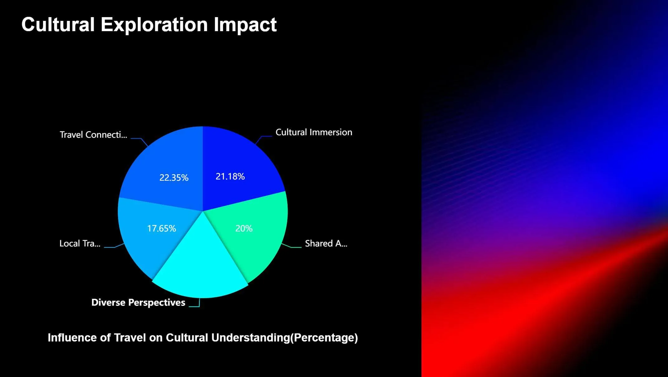
2. Pie Charts
These are great for showing percentages and proportional relationships.
3. Line Charts
Perfect for showing changes in continuous data, like stock prices or temperature trends.
4. Scatter Plots
By looking at how points are scattered, you can see if variables are correlated—positive, negative, or not at all.

5. Flowcharts
These visualize steps, processes, or workflows. Flowcharts use different shapes (like rectangles, diamonds, circles) and arrows to show each step or decision point. Each shape represents a specific action or decision, while arrows show the direction of the flow.
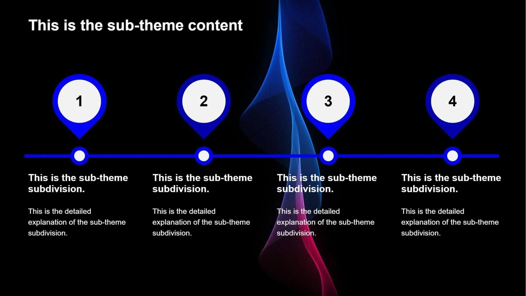
6. Timelines
Display events in chronological order. They are ideal for showing historical events, project schedules, product launches, or other time-related information.
7. Maps
Used to display geographic data or regional information. Colors, icons, or markers can represent different data values on a map.
8. Venn Diagrams
These use overlapping circles to represent different sets. They are perfect for showing relationships between sets, like intersections, unions, and differences.
9. Heatmaps
Heatmaps use color intensity or shades to represent data magnitude or density. Colors typically range from light to dark or cool to warm to indicate increasing data values.
They are well-suited for visualizing geographic data or website user behavior patterns.
10. Pyramid Diagram
The pyramid diagram takes its shape from an actual pyramid, showing a decrease in importance, quantity, or hierarchy as you move from the broad base up toward the narrow peak.
This visual approach is widely used across business, management, and education—for instance, to illustrate corporate organizational frameworks or project management sequences.
How to Create an Infographic?
1.Define Your Topic
First, think about what you want to communicate. Are you showcasing data, comparing different items, explaining a process, or telling a story?
2.Gather and Organize Information
When creating data-driven infographics (like pie charts, bar charts, or line charts), solid data is essential. So before making infographics , you need to collect the data first.
Always gather data from reliable sources, such as government reports, academic research, or industry surveys. Ensure it’s accurate, complete, and up-to-date.
Then, carefully sort, categorize, and summarize the data. Focus on key points relevant to your topic, and remove anything unnecessary or repetitive.
For infographics that don’t rely heavily on numbers, do the same: collect trustworthy information and distill it into clear takeaways.
3.Choose an Infographic Template or Tool
Pre-designed infographic templates only require you to import data or enter relevant information, for example, Smallppt's AI Slides.
Office software like Microsoft PowerPoint or WPS Presentation includes basic infographic features, allowing you to create simple visuals with shapes and charts.
Tools like Canvacan be used directly in your browser. They offer rich template libraries and resources, making them user-friendly for those without design experience.
4. Optimize Your Infographic
Align the infographic’s style with your topic and audience. Adjust text, colors, charts, and other elements to meet your specific needs.
5. Review and Update
Carefully review all text, data, and visuals in your infographic. Confirm accuracy, completeness, and consistency to prevent errors or misunderstandings.
If information or data changes before you publish your infographic, remember to update it promptly.

Using Smallppt to Create an Infographic
If you’re unsure where to start before making an infographic, just input your topic into Smallppt’s AI Mind Map. This tool sparks creativity, helping you explore connections visually through a tree-like structure. It branches out from core concepts to related points, allowing you to quickly build an information framework.
Already have text but struggling to refine key points? Hand it to the AI Summarizer. Ask it questions, clarify your points, and refine the output through conversation until you're happy with the result.
Actually, you can handle all this within AI Slides. Provide a theme, and it will auto-generate the text outline and populate your presentation slides.
You can also upload relevant documents or URLs – it will extract core information for you.
When generating presentations, AI Slides intelligently matches suitable charts and fills them with accurate data.
If you only want infographic templates, click "Generate" after your text outline is created. This takes you directly to the template library to choose your design.

Infographics bridge the gap between intricate details and intuitive understanding. They make information easier to digest and remember.
With their visual appeal and efficiency in communication, infographics are popular across education, business, media, and more. They’ve become a go-to tool for sharing ideas.
Learning how to make infographics lets you share messages clearly and powerfully in any setting. Go ahead and try it!


