Creating visually appealing slides is more effective in capturing the audience's attention. Designing slides requires not only filling them with content but also considering the layout and typesetting of elements like images.
So, how can you make your Google Slides look stunning, cool, and beautiful? Follow the steps in this article to make your presentation from boring to breathtaking.
Benefits of Making Your Google Slides Look Pretty
1. Attract attention. Among vast amounts of information, slides with unique designs and visual effects can quickly grab the audience’s attention, making them more willing to focus on the content being presented.
2. Enhance the audience’s understanding of information.By using visual elements like charts, graphs, and images to present information, complex content can be simplified and visualized, helping the audience better comprehend and absorb the ideas you want to convey.
3. Boost presentation effectiveness. Visually striking slides can add luster to the presenter’s delivery, elevating the professionalism and credibility of the entire presentation. Additionally, polished designs and smooth animations create a positive atmosphere, making the presentation more engaging.
4. Strengthen audience memory of the presentation.When slides have a strong visual appeal, the audience will retain a deeper impression of them, ensuring the presented information stays in their memory for longer.
How to Make Your Google Slides Stunning
1. Use High-Quality and Attractive Images
When creating presentations, prioritize high-resolution images to enhance the overall quality of your slides. Low-resolution images can appear pixelated and unprofessional, especially when displayed on large screens.
• If your slides follow a minimalist style, opt for simple images with solid or clean backgrounds, avoiding cluttered elements.
• For complex images, ensure they are visually pleasing and well-composed rather than chaotic.

2. Create Hierarchical Layouts for Content and Images
Organized layouts provide a better visual experience. If you lack inspiration, refer to templates from Smallppt for guidance.
• Align text or arrange it in a staggered yet structured order. For multiple text boxes, use Google Slides’ ruler tool for manual alignment.
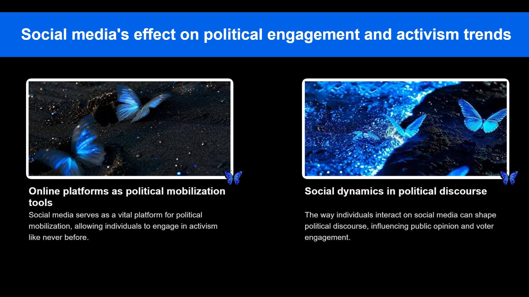
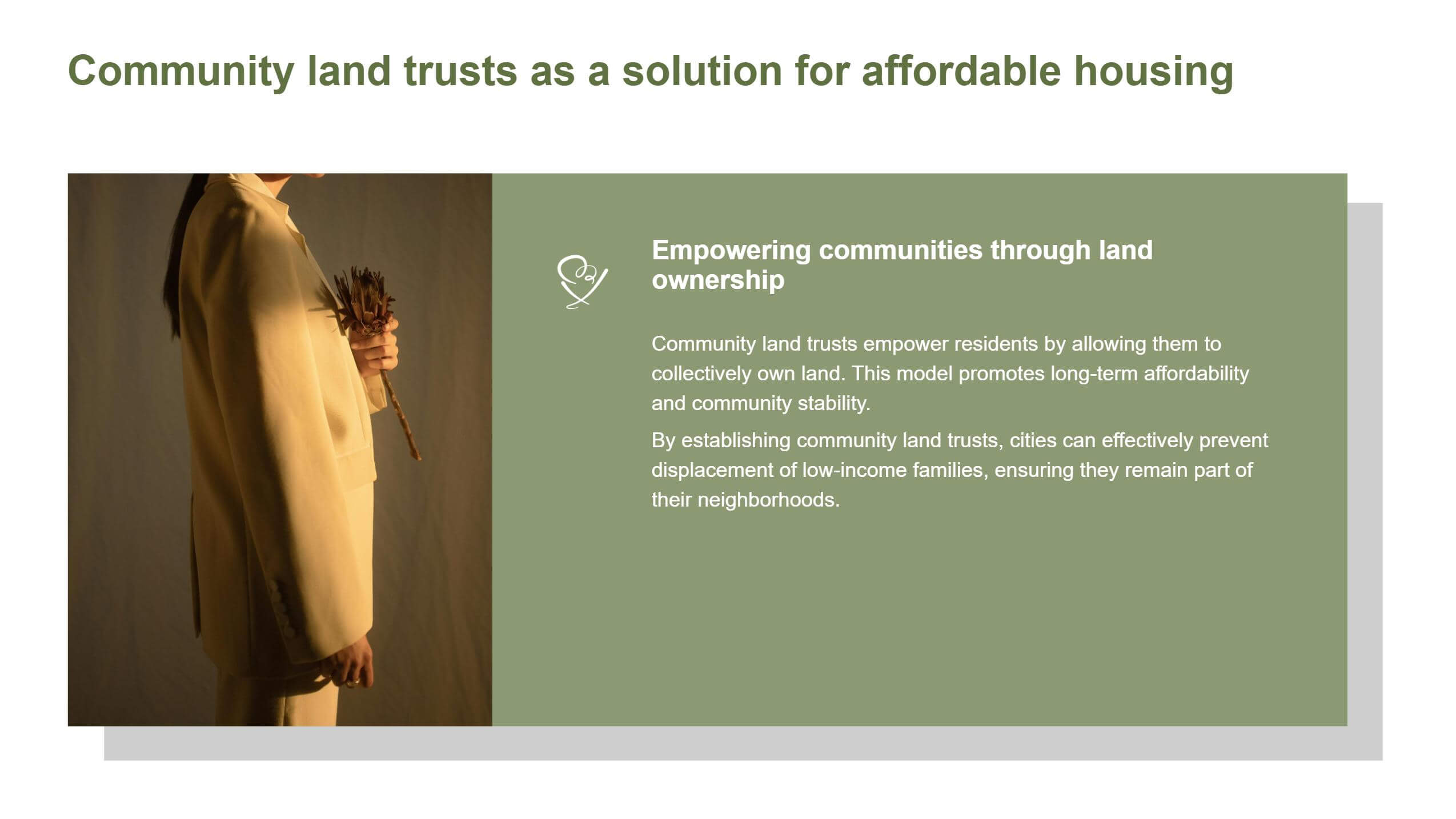
• The simplest layout is split-screen: place an image on one side and text on the other. To avoid monotony, you can overlay a colored shape or border beneath the image. Similarly, highlight key text by adding borders or colored shapes behind it.
• However, there should be enough space between modules to avoid crowding information together and giving people a suffocating feeling. You should pay attention to adjusting the spacing of texts and the distance between various elements.
If you don’t know how to adjust the spacing of texts, you can refer to the previous tutorial.
3. Add Animation
To enhance visual presentation, you can apply entrance animations to slides or elements like images and text. However, if your presentation has many slides, avoid adding animations to every element to prevent visual fatigue for the audience and potential delays in the presentation.
4. Color Harmony
The color matching of the page should be harmonious, so that the audience can see the logic, and even if the colors are rich, people will not feel confused. You can first select one or two main colors, and use this as the core, and find pictures, icons, or adjust the text color around the theme color.
Additionally, ensure contrast in both color and size to create visual hierarchy, making primary and secondary elements instantly distinguishable. If all text uses identical sizes or lacks differentiation between titles and body content, the audience will struggle to locate and grasp key information.
5. Add Charts
If your presentation includes substantial data, present it through tables or chartsto avoid chaotic data stacking and provide a clearer, more intuitive experience for viewers. This also allows you to better explain the meaning behind the data and its trends.
6. Text Conciseness
In order to make the page look neat and beautiful, it is generally better to put the key information in the slide instead of all the information in your prepared manuscript. So, if you already have a manuscript for your speech, you need to identify which key information to put in it.
Some Layout Designs for Google Slides You Can Reference
1. Like this template with dark blue and black as the theme color, you can place the white shape under the dark background image to distinguish the slide background from the image.
Additionally, instead of simply setting the main title in white, add a background color to it. This not only aligns with the theme colors but also enriches the page’s color palette.
The picture and text can be arranged in a simple top-to-bottom layout. Since there is not much text content, you can slightly enlarge the picture to enhance the visual effect of the page.
If you don't know how to set the background color for the text, you can check this article.
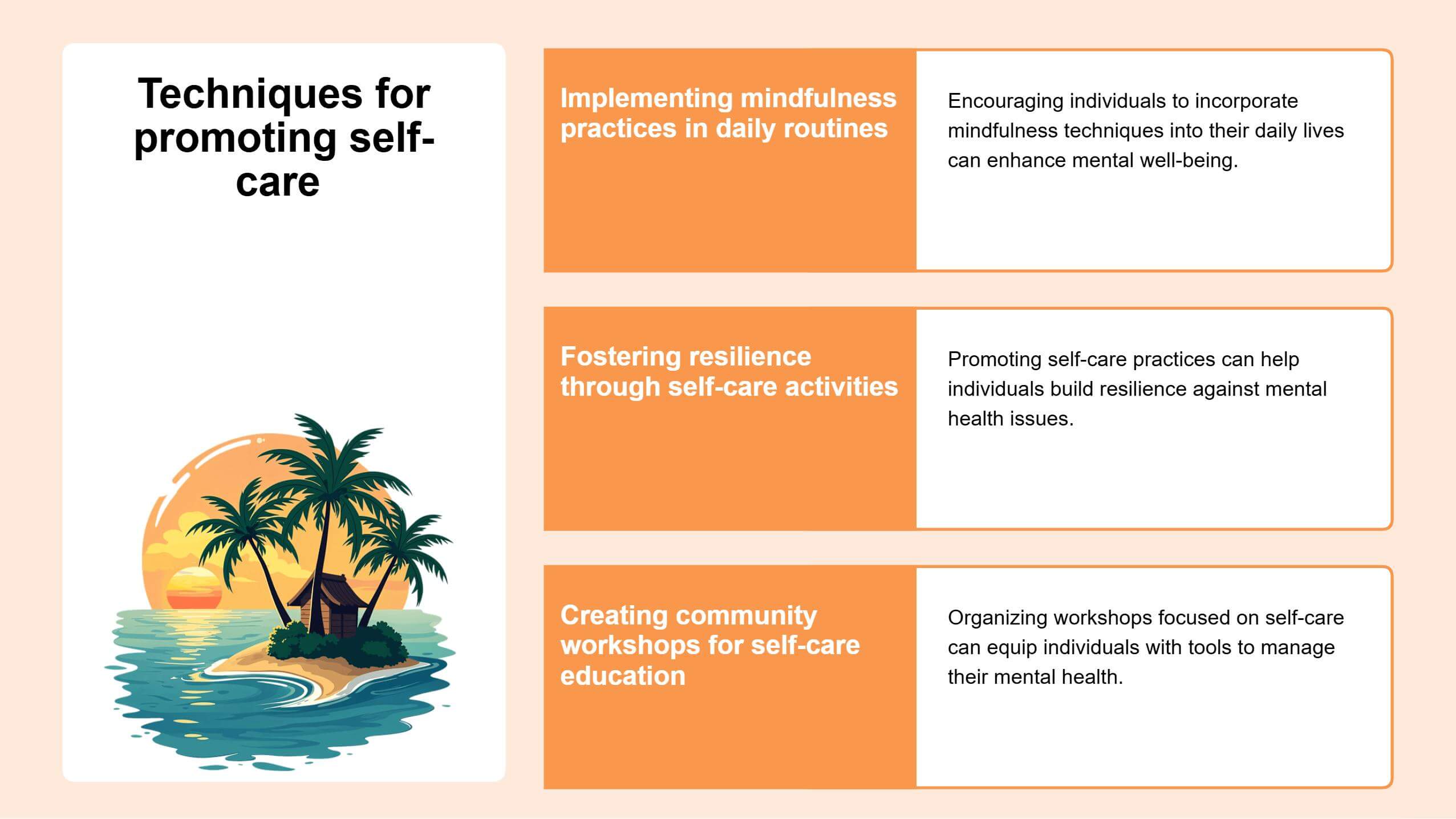
2. If a slide contains only one section of content, you can add a large colored shape to it and then add text and pictures on the shape, as in this template.
At the same time, place a large rectangle under the shape to act as a projection of the shape, and increase the three-dimensional sense of the whole part.
3. This template image is used as the background of the main title, and the text of the main title is separated by a colored shape, occupying only half of the image.
This can not only retain part of the image's appearance and enhance the richness of the picture, but also the title will not be obscured by the image.
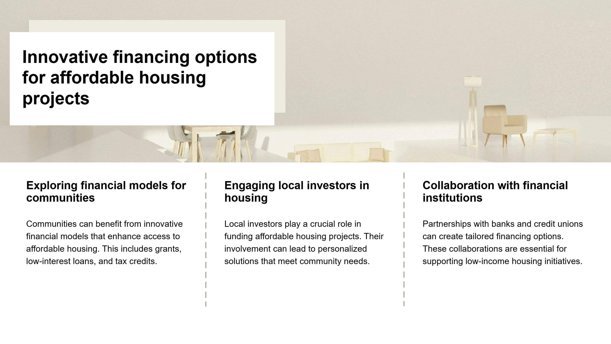
You can also put a serial number at the junction of the image and the text below, that is, above the three blocks of content, to emphasize the arrangement and order of the content.
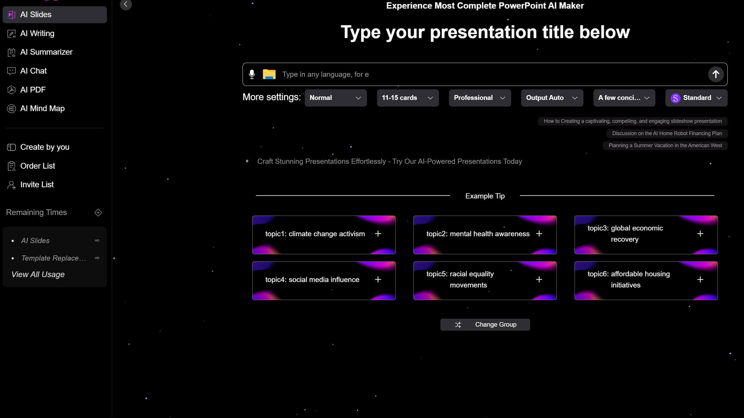
How to Create Stunning Presentations with Smallppt
✔️ If you have a full script for your presentation, input it into Smallppt’s AI Summarizer to condense the document content. It will also be more convenient for you to modify the presentation text content later.
✔️ Alternatively, directly upload related files/audio/URLs to AI Slide. It will intelligently analyze the content and generate a structured outline for your slides.
✔️ Remember to adjust the details, such as the number of slides in the More settings and then generate the outline.
✔️ Smallppt offers 20 categories with a vast library of templates. Preview and select your preferred template, then click “Generate” to proceed.
✔️ SmallPPT can create a complete presentation in seconds. You can switch templates after generation, but avoid making edits before switching, as your changes will not be saved.
✔️ If you need content ideas, consult AI Chatfor suggestions. For full-text creation, use AI Writer to draft your material.
✔️ If you plan to add a mind map of a certain content in the slide,AI Mind Map can help you save time.